Borrowed Colour: Painting and Furnishing a Room Around Its Stained Glass
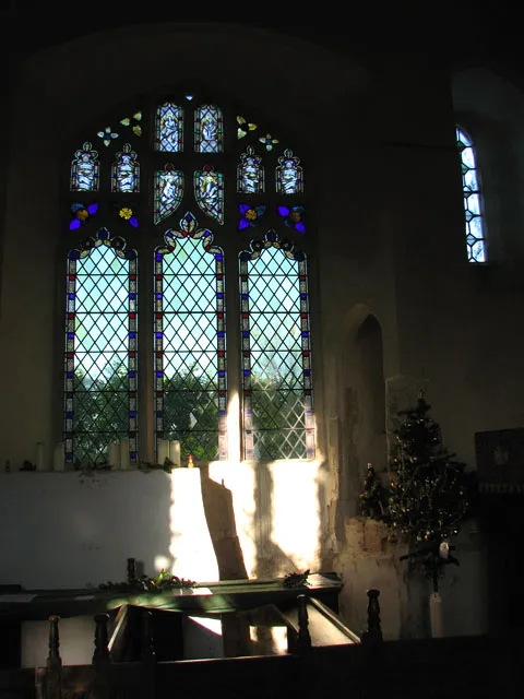
Photo: Evelyn Simak, CC BY-SA 2.0, via Wikimedia Commons
In a period house, stained and leaded glass does more than close an opening. It lends hue to plaster, timber and cloth, and it changes that loan hour by hour. A room decorated without regard to the window may leave fine glass looking dull or discordant; a room decorated with too much zeal may turn the glass into one pattern among many. The task is not to match the glass but to compose around its changing light.
Begin with a light diary, not a colour chart
Before choosing a paint colour, choose a method of observation. Cut several large cards of primed lining paper and place them upright near the window, where the transmitted light falls on them. Leave them for a full day and note what happens at morning, noon and late afternoon. A ruby border that seems sombre at eight o'clock may throw a warm coral across the room by four. Repeat the exercise in winter and again in summer. The same glass reads differently against a low January sun and a high June one, and a scheme that flatters one season may feel thin in another.
Photographs are useful, but only if taken with a fixed white balance and a grey card in frame. The camera will otherwise flatter or exaggerate the cast. The written note is often more trustworthy: whether the light is cool or warm, saturated or pale, steady or restless. This is the patient craft of decorating a period room, and it cannot be hurried.
Read the cast rather than the glass itself
The colour seen in the window is not always the colour thrown into the room. Dense blue glass may cast a grey-blue light; amber glass may warm a wall to honey. Hold a white card at several angles to catch the transmitted light, then look at the adjacent wall and ceiling. Identify the dominant hue and its temperature, and note whether the cast is strong enough to tint a whole room or confined to a pool near the window.
A green cast in a room with red furnishings can set up a vibration that some find lively and others find tiring. Complementary schemes are not forbidden, but they should be deliberate. Analogous palettes, drawn from the glass and its immediate neighbours, tend to produce a quieter result and allow the window to remain the focal point.
Grounds for walls and ceilings
Walls should generally provide a calm ground. Brilliant white is rarely kind to coloured light; it can make a rich cast look theatrical and a pale cast look chilly. Warm off-whites, stone colours and chalky greys with a sympathetic undertone are more forgiving. Where the glass throws amber or crimson, a wall with a faint ochre or rose undertone will receive the light gracefully. Where it throws blue or green, a cool but not icy neutral will prevent the room from turning grey.
In older houses, breathable finishes such as limewash or distemper may be appropriate, subject to the condition of the plaster. A ceiling kept lighter than the walls will bounce light back into the room and soften the contrast between window and interior. Paint should be tested on lining paper taped in place, never directly on historic plaster, and observed for at least forty-eight hours before a decision is made.
Textiles, timber and the quiet companions
Fabrics absorb as well as reflect. Heavy wool, linen and velvet will muffle a strong cast, while glazed chintz and polished surfaces will throw it back in hard highlights. Upholstery should echo one hue from the glass at low intensity rather than compete with the whole palette. A muted terracotta chair beneath amber glass, or a faded olive sofa beneath green, will feel related without becoming a costume.
Timber matters more than is often admitted. Oak warms a cool blue light; mahogany deepens a red one; pale ash can leave a north-facing room feeling washed. Rugs should ground the scheme without introducing a second pattern under the window. If curtains are needed, keep dressings simple and draw them clear of the glass by day, so that the coloured light is not rationed by heavy pelmets.
The north-facing room and the problem of chill
North light is steady, cool and often the only source of colour in an otherwise quiet room. Here the glass may be the warmest element in the scheme. Walls in blue-grey or cold white will make the room feel colder still. Warm neutrals, soft ochre, clay and faded terracotta can support the window without overpowering it. Artificial light for the evening should be warm and low, so that the room does not swing from coloured daylight to clinical white after dusk.
Let the glass remain the event
Restraint is the final material. A room can carry one dominant pattern, and if the window is it, the wallpaper, borders and principal textiles should step back. This does not mean dullness; it means sequence. The eye should travel first to the glass, then to the room, and back again as the light changes. A decorative scheme that upstages the window will soon feel exhausting.
Where the glass is of special historic interest, decoration should remain reversible and should never involve altering the window itself. Listed building consent may be required for certain works, and a conservation officer can advise on finishes and fixings. The aim is not to freeze the room but to dress it in a way that respects the fabric and the light.
A scheme derived from observation
The best interiors beneath stained glass feel inevitable rather than imposed, because their colours have been drawn from the actual behaviour of the window. Sample slowly, note honestly and choose the quieter option where doubt remains. The glass sets the key; the decoration provides the accompaniment. In a period home, that is the oldest and most lasting arrangement of all.